Loud on Purpose: The Typographic Uprising That Is Dismantling Design's Culture of Restraint
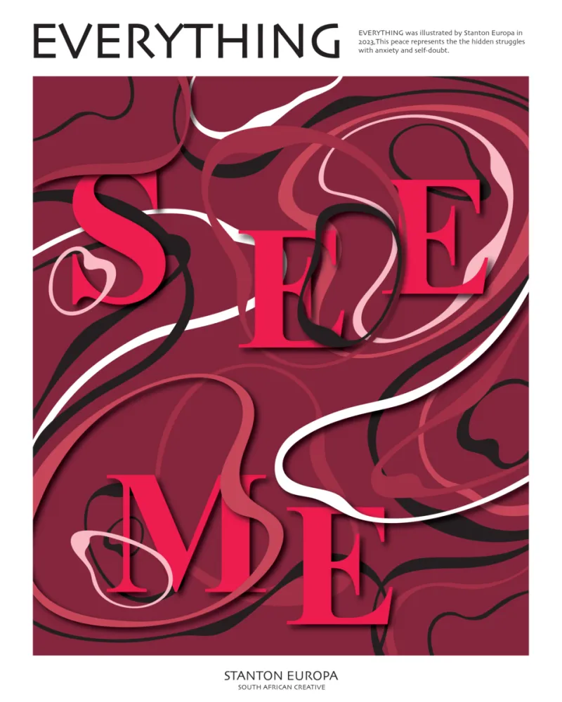
Photo: Stanton Europa, CC BY 2.0, via Wikimedia Commons
An Obituary for the Empty Page
Let us be honest about what minimalism did to graphic design. It made everything look like a startup.
For the better part of three decades, the dominant visual language of high design in America has been characterized by its absences: negative space deployed with near-religious conviction, typefaces stripped of ornament and personality, color palettes reduced to the territory between off-white and slate. This was presented — and largely accepted — as sophistication. Restraint as virtue. Emptiness as intelligence. The less there was to look at, the more refined the sensibility it supposedly reflected.
Something has broken in that consensus. Across the landscape of contemporary graphic design — in brand identities, editorial layouts, packaging, and digital interfaces — a counter-movement is asserting itself with increasing force and confidence. It is loud, chromatic, structurally aggressive, and entirely deliberate. And it is making the case, persuasively, that minimalism's stranglehold on visual culture has not elevated design so much as homogenized it into irrelevance.
The Geometry of Rebellion
Maximalist typography is not new. Its roots run through the Constructivists and the Dadaists, through the psychedelic posters of the 1960s and the punk xerography of the 1970s, through the early digital experiments of designers like David Carson and Emigre's Rudy VanderLans in the 1990s. What is new is the cultural context in which it is being deployed — and the seriousness with which the design establishment is beginning to engage with it.
Contemporary practitioners of expressive typography are not rejecting craft. They are redefining what craft means. Where minimalist design located mastery in precision and economy, the new maximalism locates it in tension, in layering, in the controlled collision of visual forces that produces something genuinely uncomfortable to look at — and therefore impossible to ignore.
Consider the work emerging from studios like Actual Source in New York, or the editorial design being produced for publications like The Drift and n+1, where type is treated not as a vehicle for information but as a primary visual element with its own emotional register. Letterforms are scaled beyond legibility, then pulled back just enough to maintain it. Serif and sans-serif typefaces occupy the same composition in open defiance of classical hierarchy. Text runs vertically, diagonally, across image, against itself. The grid is not abandoned — it is interrogated.
What Corporate Minimalism Costs
To understand why this rebellion is happening now, it helps to understand what minimalism became in the hands of corporate design culture. What began as a principled aesthetic position — rooted in genuine philosophical traditions, from the Bauhaus to Swiss International Style — gradually calcified into a set of easily reproducible conventions that required no philosophy at all to execute.
The visual homogenization this produced is now so pervasive as to be almost invisible. Open a direct-to-consumer brand's website, a premium food product's packaging, a wellness company's app interface, and you will encounter the same Helvetica-adjacent sans-serif, the same generous margins, the same muted palette gesturing toward "natural" or "clean." The aesthetic signals sophistication without earning it. It performs restraint as a substitute for thought.
For a generation of designers who came of age inside this aesthetic monoculture, the fatigue is not merely stylistic. It is ethical. When every brand sounds the same and looks the same, design ceases to communicate anything except the desire to appear credible. It becomes, in the most precise sense of the word, corporate — a tool of institutional neutrality rather than genuine expression.
Maximalist typography is, among other things, a refusal of that neutrality.
The Cultural Argument
The designers driving this shift are making a larger argument about what visual culture is for. If minimalism's implicit claim was that good design transcends its cultural moment — that the right typeface and sufficient white space produce a kind of timeless authority — maximalism insists that design is always and inevitably situated. It reflects a time, a politics, a set of anxieties and energies. To pretend otherwise is not sophistication. It is evasion.
This argument has particular resonance in the current American cultural moment, where the appetite for visual sincerity — for design that admits to having a perspective — has grown considerably. The clean, neutral aesthetic that once read as aspirational increasingly reads as avoidant. In a culture saturated with branded content optimized for frictionless consumption, friction itself has become a form of honesty.
There is also a generational dimension worth noting. The designers most actively engaged in this typographic revolt are largely millennials and older Gen Z practitioners who grew up online, fluent in the visual vernaculars of meme culture, fan art, zine aesthetics, and the deliberately ugly traditions of internet design. For them, the maximalist impulse is not a rejection of digital culture but an integration of it — a recognition that the screen, for all its capacity for pristine minimalism, is also a space where chaos, density, and visual excess have always coexisted with restraint.
The Question of Legibility
The most persistent critique of maximalist typography — and it is a legitimate one — concerns legibility. Design's fundamental obligation, the argument goes, is communication, and communication requires clarity. When type becomes texture, when the letterform dissolves into visual noise, something essential is lost.
The best practitioners of expressive typography take this critique seriously. The goal is not illegibility for its own sake but a recalibration of the relationship between reading and looking — a recognition that both are valid modes of engaging with text, and that the tension between them can be generative rather than merely confusing. A poster that requires a second look, a cover that demands to be held rather than scrolled past, a logo that rewards close attention: these are not failures of communication. They are invitations to a different kind of engagement.
A Correction, Not a Revolution
It would be overstating the case to declare minimalism dead. It remains a powerful and legitimate visual language, capable of genuine elegance in the right hands for the right purposes. What is dying — or should be — is its status as the default mode of serious design, the unexamined assumption that restraint is always more sophisticated than expression.
The typographic uprising currently reshaping American graphic design is best understood not as a revolution but as a correction — a necessary expansion of the visual vocabulary available to designers who want to say something more specific, more urgent, and more honest than a well-kerned sans-serif and a lot of white space allows.
Design, at its most consequential, has always been an argument. The maximalists are simply making theirs visible.